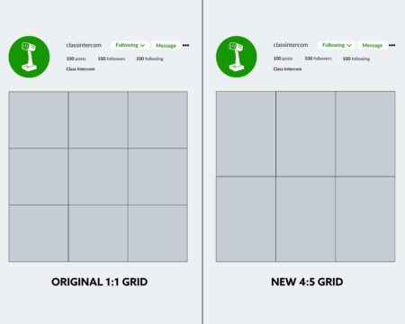
When creating content, it’s best practice to ensure your posts are sized correctly for the social media platform you’re publishing to. Instagram is gradually phasing out its iconic 1:1 grid in favor of a more creator-friendly 4:5 ratio. With the growing popularity of reels and the influx of vertical (non-video) content on the platform, this drastic shift makes sense. Additionally, Instagram expanded the number of photos and graphics in a carousel post from 10 to 20 frames, offering more flexibility in content presentation.
What do these changes mean for those who aren’t content creators? What processes or strategies should your communications team start implementing? And if you, as an Instagram user, haven’t received the grid update yet, how can you prepare for the full 4:5 integration? We’ll break down everything you need to know to make the most of these updates.

Instagram is shifting from the traditional 1:1 grid (left) to a new 4:5 ratio (right), impacting how your profile feed will display. These mockups show the anticipated visual changes when followers visit your page.
The Impact of 4:5 on Existing Content
When Instagram users visit your school’s profile, they see all your public posts arranged in a grid. For many, maintaining a cohesive grid layout is important. While it might seem trivial, a well-organized grid often sets professionals and amateurs apart.
Those who tailored their content to fit the 1:1 ratio may notice their grid doesn’t look quite as polished with the new 4:5 ratio. Once the update is fully integrated, all posts published prior will be automatically stretched to conform to the new 4:5 sizing. This adjustment can result in awkward cropping of graphics and photos, potentially disrupting the visual harmony of your profile.
A disjointed grid can undermine the trust and professionalism your school aims to convey, making it harder to turn profile visitors into engaged followers, students, or community supporters. For schools, especially those with a social media-savvy community, maintaining a visually cohesive grid is essential for fostering engagement and building a strong online presence.
Maximizing Your Carousel Potential
Some users fall short when it comes to using carousels to their fullest. A carousel is a feature that lets you include multiple photos, videos, and graphics in a single post, allowing your audience to swipe through them. Long before carousels were introduced, users across the platform faced challenges with cramming a lot of information into a single graphic, choosing the best photo from an event, or hoping a video could capture the full story.
Now, with up to 20 frames at your disposal, you can effectively share more about what’s happening at your schools using a mix of photos, graphics, and videos. For example, if you’re highlighting a school event or district-wide event happening at multiple schools, you can include a variety of content in a single post. We featured an example from Berea City School District, where they included 10 photos from a special event: high school athletes welcoming elementary students as they arrived at school. Each frame captured smiles, high-fives, and fist bumps, making the post more engaging and capturing the experiences of many kids at this event.
How to Move Forward
While the carousel update is accessible to all users, the 4:5 grid is slowly making its way across users on the platform. During this interim period, what can you do to make sure your posts look cohesive? What habits should you implement within your team when it comes to creating content?
When capturing content in the classroom or at school events, a habit must be built to take a few vertical photos and videos specifically for Instagram and other platforms that favor vertical content. While it’s great to get content that’s flexible and works for various marketing initiatives like web content and print assets, Instagram is now a special use case. Emphasizing the need for taking both vertical and horizontal on a shot list is crucial, even though with current 1:1 ratios, it’ll be a relief to see any future materials seamlessly change into the 4:5 grid.
The most tedious, but crucial, adjustment will be with graphic design. Designs should be created as a 4:5 ratio while ensuring that all information fits well within the current 1:1 grid until the transition is complete. While this may be extra work, it prevents your grid from appearing awkward and ensures that all necessary logos and text are effectively displayed.
We know keeping up with updates as transformative as the 4:5 grid can be overwhelming and stressful. Fortunately, Class Intercom is here to keep you updated on the latest school social media best practices. As a platform built by educators, for educators, we provide schools with the tools and support they need to use, model, and teach social media in impactful and authentic ways. Ready to learn more, connect with us using the link below.
